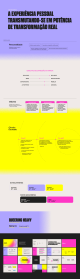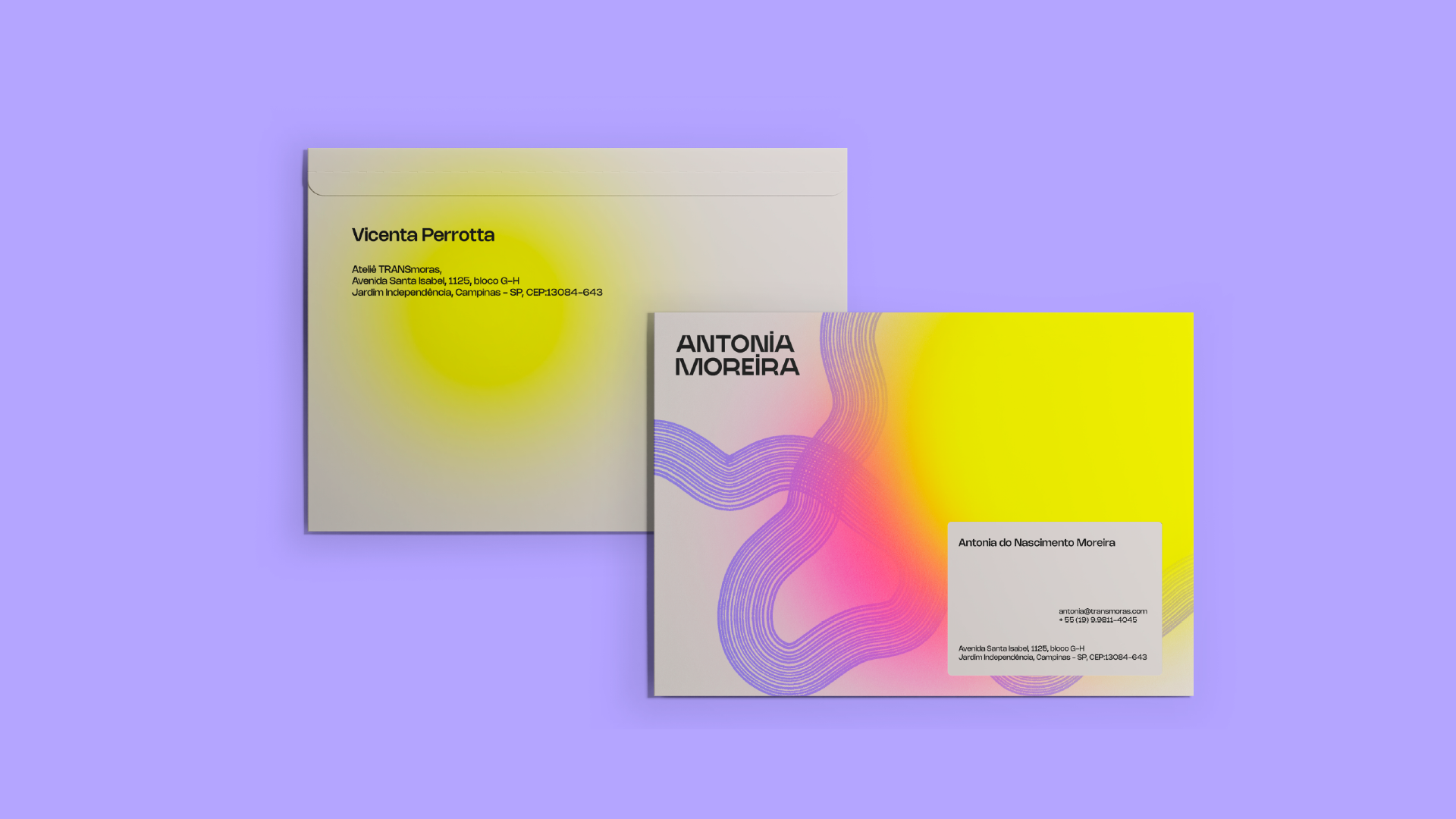
Antonia Moreira
Antonia is a travesti who uses her experiences to provoke significant social changes in the world. Eloquent and with a career focused on human rights, she believes that her uniqueness lies in her access to marginalized discourses and the skills she has developed over time to address the challenges of the world. The goal of this work was to convey all this power into a visual identity that represents Antonia's complexity. Navigating between the corporate world and activism, the challenge here was to create a bridge that would connect them and support what Antonia advocates as she permeates both.
The choice of clear and legible typography sought to bring consistency, reach, and depth to the message she conveys. The organic graphics, inspired by tree age rings, allude to the rhizomatic way in which Antonia navigates various contexts, fluidly and adaptably, without losing her roots. The composition between the elements was intentionally kept clean to give space to the brand's own voice and the legibility of its content. As for the colors, intense and expandable, they reflected the strength, intensity, and pursuit of renewal brought by a transgender person aiming for significant changes in reality.